 How can I use Blender to make
a model for MMD? How do I create the details on the face of my MMD model? How do I make the eyes for my MMD model in Blender? How can I use Blender to make
a model for MMD? How do I create the details on the face of my MMD model? How do I make the eyes for my MMD model in Blender?
Making Your First Model Part 11
Adding the Facial Details
Adding the what?
Well . . . The inside of the mouth, the eyes, and the
eyebrows. Facials are what the actual shape keys used for lip-syncs,
blinking, and so forth are called.
So, not facials. But I couldn’t think a better word for
this!
So, let’s talk a little about MMD faces.
Let’s use MMD’s default Miku model as an example.
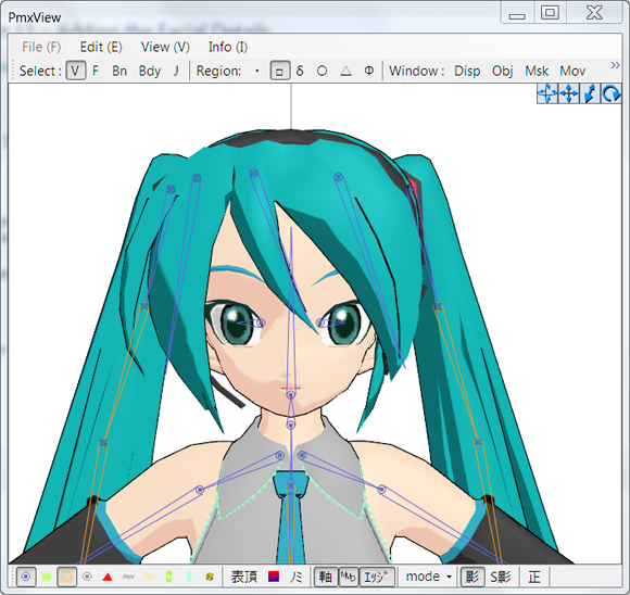
Let’s start by masking her skin so we can see the inside
of her face.
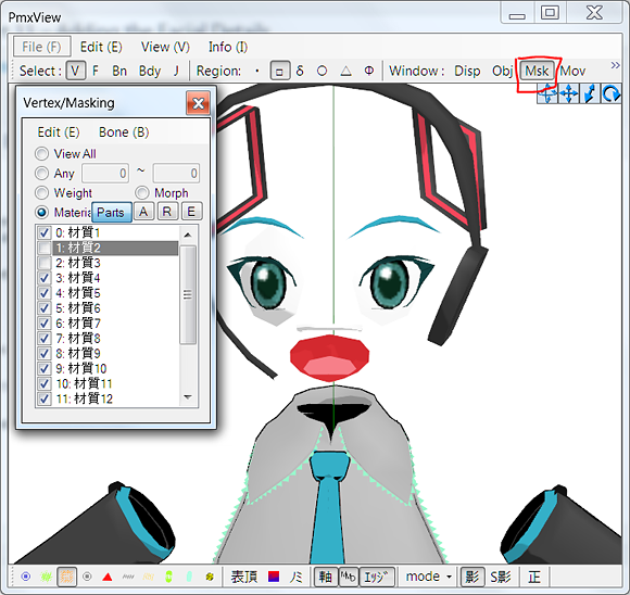
Eek! That’s kind of scary!
Before I start to explain her features, I want to point
out the Vertex/Masking window in PMXe. Once you start weighting, it
will be your best friend. But
for now, it’s just a tool to help us dissect the model and how it is
made.
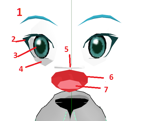
So, let’s start with the most obvious feature.
Number one is the eyebrows. One of the most tempting
things to do when all of your knowledge of 3D modeling comes from The
Sims is to just draw them on with a texture. However, that’s wrong. The
main reason you don’t want to do that is that it would be a nightmare
to do facials with them drawn on! Another reason you need to model them
is because modeling them gives them depth.
But the main reason for model makers to model the
eyebrows? If your eyebrows are their own object, you can waggle them
around as much as you like by only moving them and not affecting the
face mesh.
The second feature I highlighted is the eyelashes. As
before with the eyebrows, it is a good idea to model these separately
from the rest of the face.
The third is the iris itself. I had a bit of a struggle
with irises in my first MMD model.
Here’s what you should never do . . . Create an eyeball,
and then change the area where the iris goes to a new material.
In MMD models, the irises are supposed
to be connected to the eye bone. When you connect
the irises to the eye bone, it allows the user to move the model’s eyes
from side to side, up and down, so on so forth. If you create a new
material directly on the eyeball, there will be a gaping hole whenever
the iris is moved!
The fourth is the white of the eye.
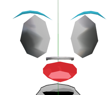
For this, I added a sphere file to try and
show the roundness of the whites of Miku’s eyes.
Now, why would it be important for the whites of her
eyes to be rounded? It’s important because her irises are slightly
rounded also.
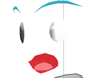
Now, that’s all fine and dandy . . . but let’s look at a
model that is newer.
Michi-K
is my inspiration. If I could steal the
talent of one modeler, it would be her.
So, how does she handle the whites of eyes?
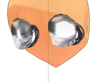
They’re concave! While Miku’s were convex, these are
concave.
What advantages would a concave sclera have over a
convex sclera?
Clipping. With a concave sclera, you don’t have to worry
about facials (or shape keys) causing the iris to run into the whites
of the eyes.
However, with a convex sclera, looking at the model
directly from the side would look a bit more realistic. However, very
few people zoom close enough to notice. Even if they did, however,
setting the sclera to a bright white would trick the eye into thinking
that it must be convex also. Remember, I had to mask the majority of
the model and add a sphere file just to determine if it was convex or
concave to begin with!
Now, let’s talk about number five . . . Teeth. Now, the
default Miku model having teeth is strange. There is no combination of
facials that would reveal the teeth. Nor is there any facial that move
her teeth to a realistic position.
Let’s contrast that with the Rin model.
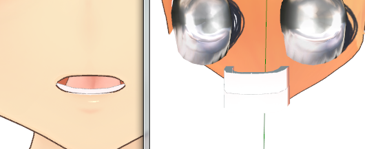
On one side, we have Rin saying “Eh”. On the other, we
have the face masked to show her teeth. Her teeth are in the way of the
inside of her mouth! How is she saying “Eh” ?
Simple – shape keys. Or facials – they’re the same thing.
When she needs to show the inside of Rin’s mouth, she
moves the teeth away to show it. This comes with one somewhat major
problem, however.
That’s not how teeth physically work. For your bottom
teeth, oh, of course! When you move your jaw, your bottom teeth move.
However, your top teeth are stationary. There’s no face you can make
where your top teeth will move. (Try watching “The Boondocks” after
learning that. If you’re a stickler for animation, it will drive
you mad.)
But I won’t fault Michi-K for that because . .
. Look how adorable Rin is saying “eh”!
For that reason, I suggest following Bandage’s method
in his TDA Bliss model.
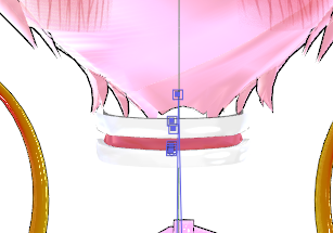
The teeth are a realistic distance apart.
Alright, that was enough on teeth.
Number six was the inside of the mouth.
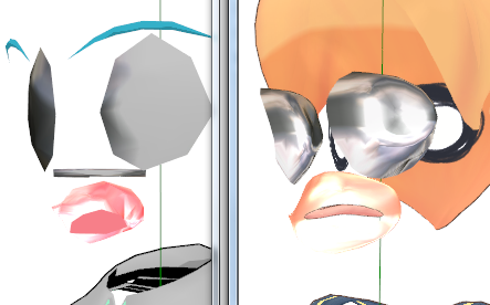
Here, Miku and Rin have something in common! The insides
of their mouths are both just convex caverns where the tongue lives.
With that out of the way, on to number seven . . .
The tongue.
Now, here’s the thing about the tongue. If you don’t
make any shape keys that utilize it, it makes no sense to have one. For
Miku, her tongue is just a sad, bent plane that exists to make her
facials look a bit more realistic. However, Michi-K’s Rin has an
adorable little tongue that is used in shape keys.
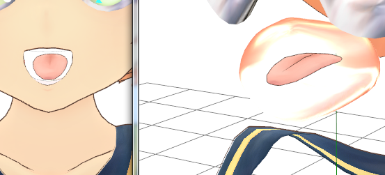
If you have no interest in making shape keys that
utilize the tongue, you can feel free to simply color a bit of the
inside of the mouth as a tongue. However, you should aspire to make a
great model with a ton of shape keys!
So, using this knowledge, let’s apply it to our work.
The first thing we can decide is that everything will be
mirrored using the mirror modifier to save time. One reason not to do
this, however, is that it may be easier to model things like the teeth
(which cross over the X axis) off to the side. It depends on how you
feel as you’re doing it.
So, the most obvious thing to do first is the eyebrows
and eyelashes.
While working on the face, it’s a good idea to select
the bangs in object mode and press “h”. This hides them so that we can
see what we’re doing.
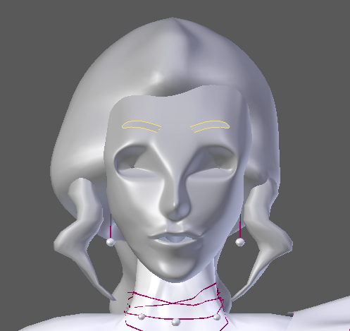
I didn’t document the process to make the eyebrows . . .
But it was quite similar to all of my processes! Create a plane and
extrude it to roughly the right shape, add a subsurf modifier, and then
extrude and cut away until you have what you want.
I did the same for the eyelashes. However, I ran into a
bit of a problem. The problem? I’m not that great at modeling yet! It
doesn’t look the greatest, but with enough “W: Smooth”, I felt like I
got close enough!
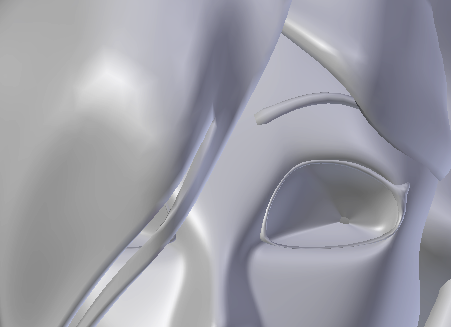
Now, even though it makes less sense to do it next, I’m
going to tackle the iris. Why? Well, because I put it before the whites
of the eyes on the diagram.
Now, here’s a cool thing about Blender. You can start
out with a lot of different options! Since the irises will be circular,
let’s start by adding a circle.
Make sure to add the circle in edit mode and as a
primitive. If you add a circle (under curves) in Object mode . . . You
get something else entirely!
Lower the number of vertices in the circle so that it’s
a little easier to work with.
It’s tempting to just press “f” to fill in the face.
Don’t do it though! We want to be able to edit it! So instead, select
two edges across from each other, one at a time, and press “F” to fill
each of those with a face.
Next, let’s add some loop cuts so that we can adjust how
convex it is.
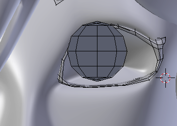
And after a bit of adjusting and moving about . . . Here
is Camila with her iris in place!
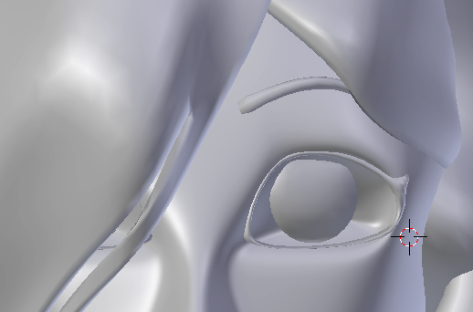
Now, for the whites of the eye. There are actually two
ways to do this. Model it, or set the current eye socket as a new
material.
After failing to model one that fit in the current
socket, I tried to change the material of the actual socket. (Note, I’m
using a placeholder material that was going to clash with the default
material.)
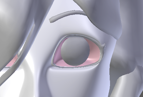
Now, here’s the problem. Due to the subsurf modifier,
the colors are running together in a weird way.
But, as I’ve said before, this is a tutorial for n00bs. Sometimes, a
n00b just has to live with the fact that something is over their head!
Now . . . For the teeth.
Start off the way we always do. Plane, extrude, loop cut
. . .
Be glad these aren’t videos, because I just spent a good
minute poking my face to figure out where exactly in my head my teeth
are in proportion to everything else!
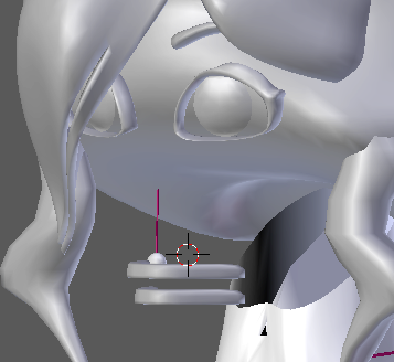
After the debacle with the sclera, I was overjoyed that
I got the teeth in really easily! Now, for the inside of her mouth . . .
I had an insane idea. Make a sphere, cut it in half in
front and on the side . . . mash it into the axis to force it to clip .
. . and then adjust that.
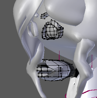
It looks pretty ugly . . . but it should work! Now, onto
the tongue . . .
Like before, let’s try to make it by mashing things
against the X axis.
And, I don’t know how, but it worked!
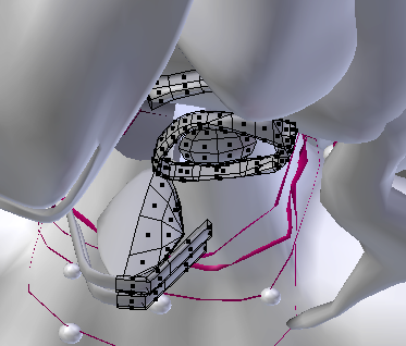
Now . . . if you look at Camila as she is now, you’ll
notice that she’s a weird mish-mash of random placeholder materials.
We’re going to cover assigning materials in the next part!
So tune next time when we give Camila a little color!
<
Previous Tutorial CONTENTS PAGE Next
Tutorial >
|

