 How can I use Blender to make
a model for MMD? How do I set up Blender for making an MMD model? Where
do I get the MMD Tools for Blender? How can I use Blender to make
a model for MMD? How do I set up Blender for making an MMD model? Where
do I get the MMD Tools for Blender?
Making Your First Model Part 24
Explaining Spheres, Toons, and Textures
Ah! The last part of making your model! Or, you know, one of the parts you’d usually do a few steps ago.
Before we even touch Camila, let’s make some spheres.
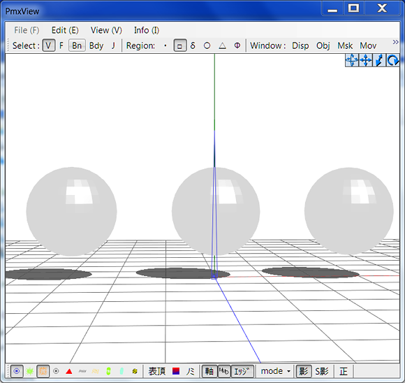
Alright, making a joke about how we made sphere meshes instead of sphere files verges on pun level humor . . . So we’ll not mention that.
Now, for these spheres, I gave each one its own material.
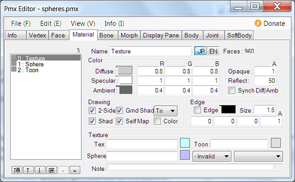
I named them for what we’re going to add to them. For Materials, I
unwrapped the UV map and modified it a bit for the purposes of this
tutorial. I also added a seam and unwrapped the other spheres, but I
didn’t edit them.
With that out of the way, let’s get started on making the images.
Should I download GIMP?
I have an insanely low data cap. That means that finding out that “lightweight” GIMP had an 80mb download scared me away.
Another thing to note is just that I hate installing new programs on my computer because I’m paranoid about messing up settings. If there’s a portable version, I’m all over it.
So, while most people here would probably tell you to get GIMP . . .
I’m here to say that if you already have an image editor with layers,
you probably don’t need GIMP.
I use a combination of Easy Paint Tool SAI and Photoshop for the most
part . . . Though if I need to do something like add one little
rectangle to a reference image, I use MS Paint.
What program do I need to use to make .sph files?!
So, if you’re like I was when I started, you haven’t downloaded a
single model that didn’t come packaged with MMD. That means that your
knowledge of sphere files comes from “metal.sph”.
You can make a .sph file by changing the extension on a .bmp file. You can make a .sph a .bmp by changing the extension. However, PMXe will accept almost any image file as a sphere . . . So don’t worry – you won’t need to change any extensions for this!
Do my spheres need to be spherical?!
Nope. Well . . . Kinda, but mostly nope. Are there benefits to
putting in the extra effort to make your sphere file mimic a sphere? I’m
sure there are! But it won’t change much if it’s just a flat surface.
Now, let’s edit some images!
I haven’t done too much testing to see what works well and what works
poorly as far as image sizes go. Because I’m a little paranoid, I tend
to just use dimensions from models that work. Let’s hunt through our
model files to find toons and spheres to use the dimensions of!
I stole a toon from Icemega5 and a sphere from Bandages.
Because I’m feeling lazy, I’m going to make these in MS Paint using copying and pasting.
It seems like toons have to be .bmp files. Let’s start with the toon!
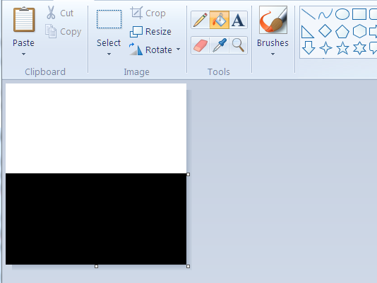
Now that we have the toon file . . . Let’s open the sph file and copy
and paste the toon file into that. Then just stretch the toon file to
fit the sphere file. . . . This sounds silly, but I have my reasons!

There’s the sphere, the texture, the toon, and the model itself! The
UV map was created so that the texture would map correctly to the
sphere. Without editing the UV map, the black part of the texture would
completely cover the entire sphere . . . and that would be a pretty lame
demonstration!
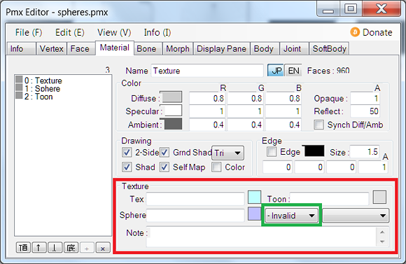
It’s rather simple from this point forward – input the material name in the correct blank. Remember! You can either have the material in the folder with the model itself or in a sub-directory. However, if it isn’t either in the folder or inside a folder inside of the folder . . . It won’t show up. And if by some stroke of magic it does show up, it won’t show up in MMD.
The second thing to note is the box that says “- invalid” on default.
You can either choose add or multiply. Add will cause the bright parts
of the mesh to shine, while multiply will cause the dark parts of the
sphere to make the mesh darker. It will not work if that setting is left on “- invalid”.
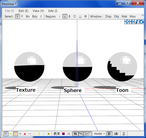
These spheres all use the images from above. In this image, the
texture and the sphere look identical. However, if you pan up (which
changes where the light is coming from), you can see a big difference
between the texture and the sphere.
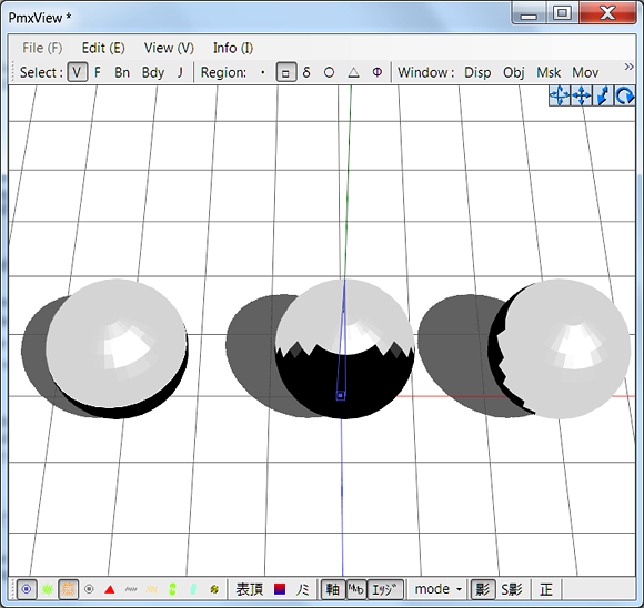
As you can see, the sphere file follows the camera. If you have a
mesh with enough faces, you can actually use that to your advantage for
silly effects.
This means that using a sphere for the bulk of your shading
is a bit of a bad idea. The shading will follow the camera, regardless
of how much sense it makes logistically. There’s a reason that when you
check a well made model’s sphere folder, it looks a bit like this:
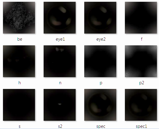
Those spheres use “Add Sphere”.
Note, when my laptop screen died, I started to use a television
as a monitor. While televisions are great for television, they make for
really bad monitors. To keep from frying my eyes, I have some pretty
weird settings. While you see a bunch of nice, spherical designs . . .
this is what I see:
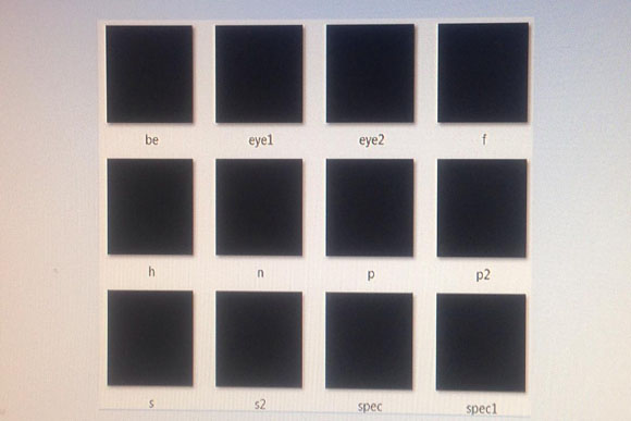
If you pressed me, I would say that the majority of well made models
use “add sphere” for their sphere files. In addition to using addition,
they also never have actual white areas, instead opting for light grays.
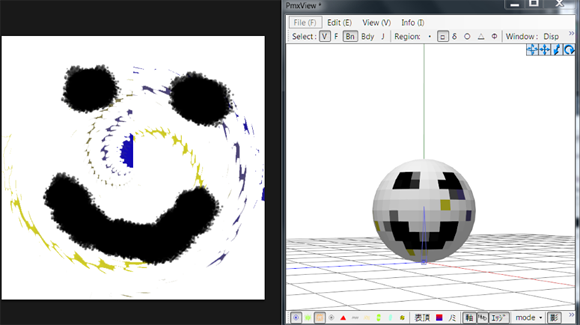
Being a little deviant, I decided to steal one of Michi-K’s spheres.
First, I applied the texture to the sphere sphere. Because I didn’t edit
the UV map for that sphere, it is completely black except for one
little area on the back.
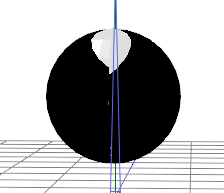
Now, let’s steal a sphere and apply it as “Add Sphere”.
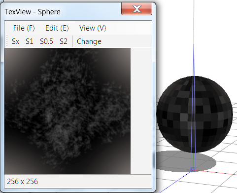
As you can see, it made the sphere a bit of a disco ball!
Spheres are used to give a little extra “shine” to a model. Too much
white on addition mode and it shines too much. Too much black on
multiply mode and it’s too dark.
As a note, yes, of course you can use
colors in your spheres! The sky is the limit when it comes to how you
use spheres to affect your model. However, if you want to use textures,
remember that adding a solid color to the sphere will completely override your
textures. Pure black on multiply mode and pure white on add mode will
both override your textures with black and white, respectively.
Alright – I’m sure that’s more than enough on that . . . now . . .
What about toons?!
In PMXe, the light is a bit different than in MMD. For that reasons,
you can’t see the toon reacting to the change in light. However, you can see it in MMD.
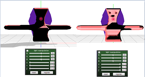
How is a toon different than a sphere if they both act similarly and can be mistaken for each other in certain settings?
The difference is . . . I’m not sure.
Do they both move with the light? Yes. Do they both override colors
if you let them? . . . Somewhat. While sphere files will outright
override the material, toon files simply overlay the materials. That
means that if you put a yellow toon on a red material, you’ll end up
with a very, very slightly orange tint.
Toons will follow where MMD thinks the shadows should be and put the toon there. A sphere lets you choose where you want the highlight to some degree.
First thing first, I want to answer the question I would have. Can a toon have a gradient? Indeed it can!
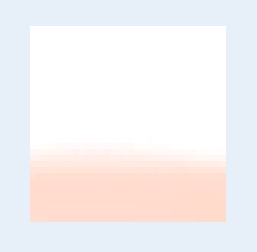
That toon comes packaged with PMXe and has a slight gradient.
However, there’s not too much of a use for a gradient as toons are meant
for “cell shading” in a sense. The more faces your mesh has, the more
you might get a use out of a toon with a gradient. For now,
however, you can just use a plain old fashioned two rectangles on top of
each other toon.
The second burning question is . . . What happens if you put the
light one on the bottom?! The answer is that . . . The highlight is
where the shadow should be! Top is the highlight, and bottom is the
shadow. If you mix them up, then each one is in the wrong place.
And the third is . . . Can you put a color where the white is?! And the answer is, yes. Of course.
And before the schoolmarm in my head smacks me with a ruler, you can
change how much is light and how much is dark based on how big each
rectangle is!
And if you add borders . . .
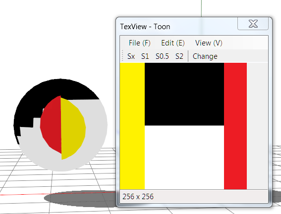
That happens! Now, let’s remember right quick that models
act differently than disembodied spheres. So, those borders wouldn’t
show up on a model like it would on a sphere in PMX. For that reason . .
. Just be conventional! Make a toon with two rectangles with the
rectangles sized based on how much highlight or shadow you want there to
be.
If you’re working from a color palette, just choose the darkest color
and make the bottom rectangle with it. You then have two choices – use
white for the highlight for a conventional toon, or use the lightest
color on the object for an unconventional toon. Let me try to
be Chef John for a second . . . It’s up to you, because you’re the Karl
Kani of your Miku Model! . . . Wait . . . That didn’t come out right . .
.
Nearly 2,000 words and you still have’t done anything!
Oh, yes . . . The sad news is that I will have to split this part
into two parts. The good news is, I still have a bit more to tell you!
Textures.
They exist and you can use them.
Partially, that’s a joke. Partially, it’s the plain truth. Textures
are just boring old textures. You paint it, then it shows up on the
model. There’s not much to them once you understand how to set them up. You just need to unwrap it so you can get a UV map, then paint the UV map.
We’ll go in to textures more when we actually start adding them . . .
Tune in next time when we actually add textures, spheres, and toons to
Camila!
<
Previous Tutorial CONTENTS PAGE Next
Tutorial >
|

