![]() Is a custom YouTube thumbnail important? How do I get my MMD video to be popular on YouTube?
Is a custom YouTube thumbnail important? How do I get my MMD video to be popular on YouTube?
Your YouTube Thumbnail image is so important!
That thumbnail image is the first thing your potential viewer will see as he looks at the offerings on YouTube.
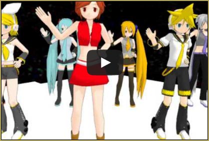
If I search YouTube for MMD Beast Fiction… which one catches my attention at first glance?
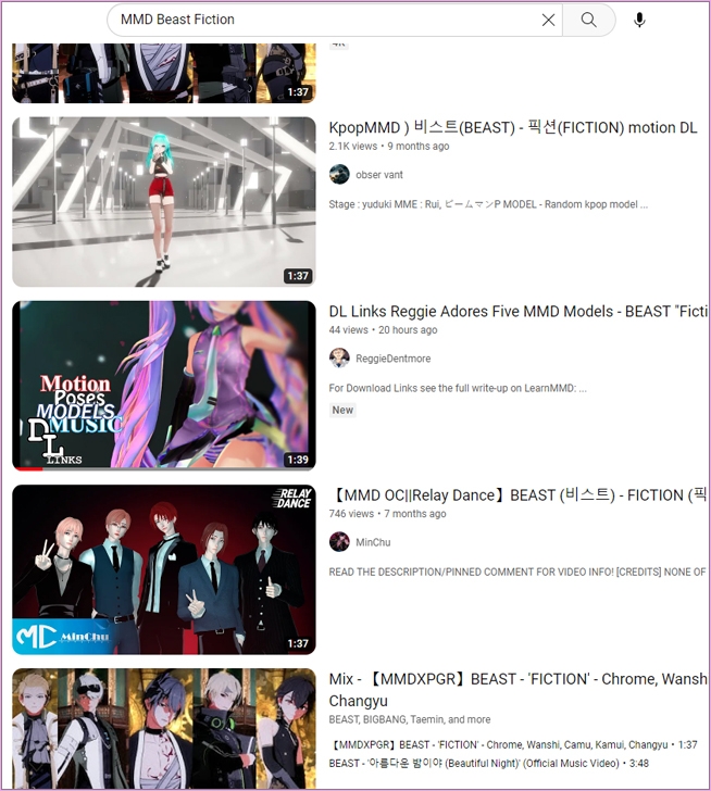
Yes… the sexy chick showing a little more than she should!
… and then my Headline, there, attracts attention as well!
DL Links Reggie Adores Five MMD Models – BEAST “Fiction” LearnMMD Slideshow
Most, or at least MANY, MMD YouTubers are looking for models and motions to download. My headline tells them about it right up front. As you write your headline, be sure to include MMD. The music artist and name of the song will also help to get views. Name the model if you have space to do so. Be creative: you get up to 100 characters for that headline.
The YouTube Thumbnail image is so important!
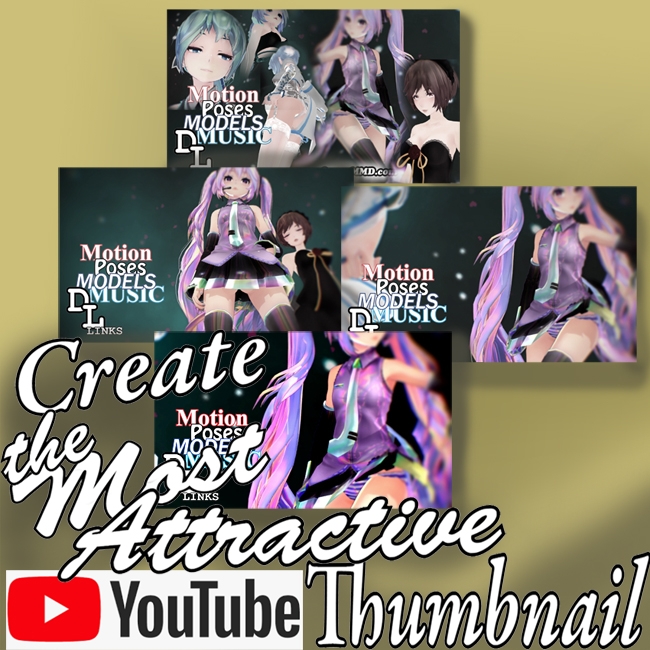
My newest video is a slideshow animation featuring five MMD models. It’s a mix of still images and motion clips as I described in this previous tutorial. I needed a custom YouTube thumbnail image that would show the viewer what to expect from my video.
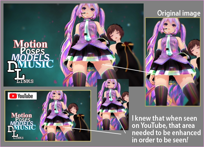
I designed this image with everything in it. It’s the one I first used when I posted my video to YouTube.
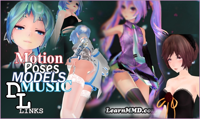
I tried to make it sexy and appealing. But I soon noticed that my new video was not getting the usual number of visits. I felt that my Headline was OK and so it must be the art!
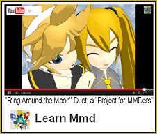
I realized that on my 24″ computer monitor the image would look only this large in a YouTube listing:
 … and on a smaller monitor or even a cell phone, this image would be too busy for the viewer to actually see what I had there. Add-in a lower resolution of that image and no one will click on it.
So… I created a second YouTUbe thumbnail image.
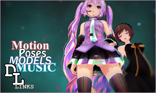
I intentionally made it “more crass” by “enhancing” the scene so that, when tiny, this thumbnail would be a little more sexy… maybe more attractive:
Is it “too creepy” to edit an image to be more sexy?
… I don’t think so… I mean, maybe it is??
With my image complete, I found that, when tiny, I could not easily see the “shapes” there, under her skirt. I went into Photoshop and enlarged the shapes a little so that, again, when seen as a tiny image on YouTube, those curves can be seen.
I uploaded that image to replace my original thumbnail image.
–
A check of my video Analytics showed me that my video was still getting fewer views than I expected.
I redesigned my YouTube thumbnail image…
I decided to move away from the previous image and to go with this one showing a bit of immodesty…
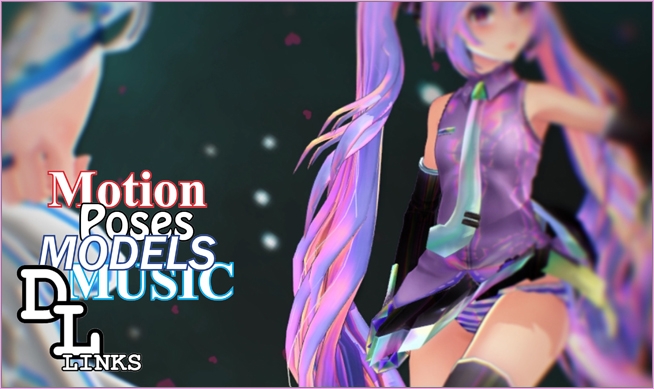
THAT ONE was working! … generating more views in a shorter time.
Today, I modified that image…
… again, to make the more attractive element more visible when that image is shown at a YouTube list size.

THIS is the image that I am going with for the time-being. When seen at YouTube on my 24″ monitor, it is this size:
… and on smaller devices, it will be even more tiny.
I have been using YouTube video analytics to see my video’s performance…
Again, I stayed with my same headline and only changed the thumbnail image to see if I can get more viewers, more quickly…
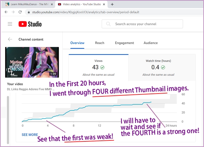
So, there it is…… Crass or creepy or creative and innovative…… you have to go with what you’ve got for the best performance of your video!
Have fun with MikuMikuDance!
– SEE BELOW for MORE MMD TUTORIALS…
— — —
– _ — –

